Understanding Revit User Interface
Revit Home Screen

Revit Home Screen
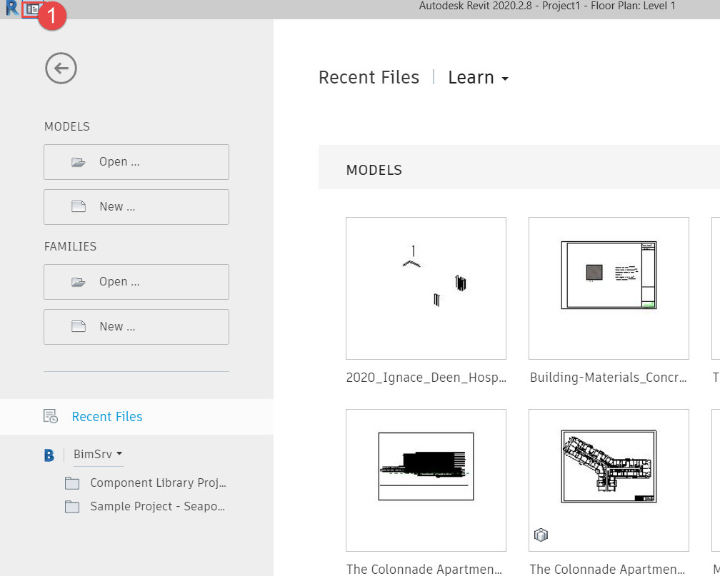
When you start Revit, you will get to see the Revit Home screen, like the image here. This is where you can start a new Model or open an existing model etc. You can get back to this, anytime using the Revit Home Button.
Revit Home Screen Toggle

Home Screen Toggle
See the top-left corner in the image above. Note the red rectangle and the number (1) Tag. This is a Toggle button, that switches the interface between the Home Screen to The Modelling Interface.
Revit Home Screen Toggle

Home Screen Toggle
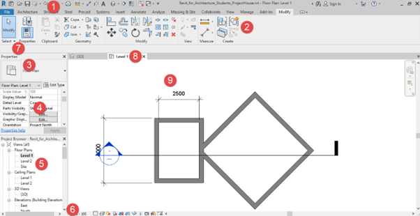
Here, the image shows, Interface switching over to the Revit Modelling one. Clicking on the Home Button indicated by the number 2 will switch back to the home screen.
Quick Access Toolbar
Quick Access Toolbar
Located on the absolute top. Quick Access Toolbar provides quick access to the most commonly used commands. This can be customized as per your needs as show in the image
Customize Quick Access Toolbar

Customise Quick Access Toolbar
The quick Access Toolbar can be customized as per your needs. Just remember to add only those items that you use the most in your daily work
Ribbon Menu

Ribbon Menu is where you see icons. The text labels are TABS. Each tab is dedicated to a set of tasks, that may be related to a discipline, such as Architecture or Structure, while others are related to a set of tasks. Each TAB is also subdivided into Panels. The panel is a set of related tasks. Sometimes, there is a small arrow at the bottom right corner of a panel. Clicking this arrow shows up settings that affect the group of related tasks.

Options Bar
Options Bar
Options displays parametric information when placing certain elements such as walls. In the case of walls, it displays options such as the Level on which the wall is placed, and the top level of the wall.
Type Selector
Type Selector
The Type Selector is “Context Sensitive”. This implies, that it changes its content based on the elements you want to model.
The Type selector is a Drop-Down, that lists various related elements. Type Selector also has a Search Bar, that lets you search for elements.
Properties Palette

Much like the Type Selector, the Properties Palette too is Context Sensitive. The content of this palette is dependent on what element is selected. When nothing is selected, the Properties Palette shows View Properties and displays Parameters that affect the view you are in. If an element is selected, the palette displays parameters that affect the selected element. Changing these parameters modifies the element.
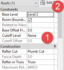
- The Parameters shown in (1) are called Instance Properties. This implies, that changing these parameters will affect only one instance of this element in your model. All other instances of the same element will remain unchanged. The properties indicated here are for one instance of a Type of element
- The TAB Edit Type lets you edit properties of a particular Type of element. Changes made here automatically affect all instances of the same type
Type Properties

Type Properties

